Selected work/Splunk · Data UX
Building a Design Org from Zero
Splunk was a data company with no design function. No team, no process, no shared language with engineering or product. Three years later it had 72 designers, a proprietary visualization system, an embedded research practice and a seat in product strategy.
ROLE
Head of Design
Design, research, program management and design systems.
TENURE
3 years
From an unrecognised function to a seat in product strategy.
TEAM
11 → 72
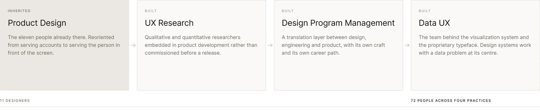
Product design, UX research, design program management, and the Data UX team behind the visualization system.
OUTCOME
$28B
Cisco acquired Splunk in 2023. Design was part of the story.
Section 01
Where Design Actually Stood
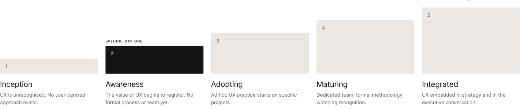
Before anything could move, the organisation needed an honest reading of its own maturity. A UX maturity audit assessed how both the design team and the executive group understood design. The answer was stage two of five: the value was starting to register, but no formal process and no dedicated team existed.
Section 02
A Data Company with a Consumer Blind Spot
Splunk sold to enterprises, and the whole organisation thought in accounts. Consumer design habits brought into that environment produced useful friction. The businesses being served stopped being treated as monolithic entities and started being treated as collections of individual people doing a job.
Customer visits became routine rather than exceptional. The team listened to how an operations engineer actually worked at two in the morning during an incident, not how a procurement conversation described the same person. That single change of unit, from account to person, is what made the software more intuitive and more human.
It also changed what the team needed to be good at. Serving accounts rewards feature coverage. Serving people rewards understanding, and understanding needs researchers, not just more designers.
Section 03
Eleven Designers, Then Seventy-Two
Growth of that size is usually described as headcount. It was closer to a capability build. The team started as product designers and ended as four distinct practices, each of which had to be argued for, funded and staffed separately.
Roughly sixty hiring decisions sat inside that growth, and each one either raised the bar or lowered it. The team hired for range rather than craft alone: people who could work in ambiguity, talk to engineers, present to executives and still care about the pixel. Consumer designers who could learn enterprise. Researchers who could run a study in three days. Program managers fluent in both design and engineering.
A career framework was built from scratch alongside the hiring, with levelling criteria, a promotion process and performance calibration. Without that, growth becomes arbitrary and people leave. Knowing what good looks like at your level, and what the next level asks for, is a retention tool as much as a fairness one.
Section 04
Research at the Speed of the Decision
Most organisations treat research as a project-level input, commissioned before a large release and delivered after the decision has effectively been made. The research team here was embedded from concept through launch, with a fast lane designed around a single constraint: the answer has to arrive while the question is still open.
The effect ran past design. Research findings started shaping feature prioritisation, product strategy and marketing. User needs stopped being a UX concern and became a reference point the whole organisation could argue from, which is a different thing from a report nobody reads.

Section 05
Program Management as Translation
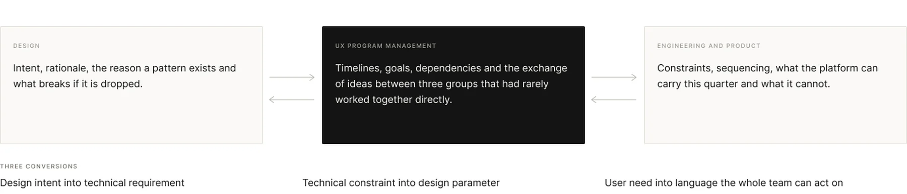
The persistent failure in design organisations is not craft. It is the gap between designers, engineers and product managers, who use different words for the same thing and optimise for different outcomes. A dedicated UX Program Management function was built to close that gap permanently rather than project by project.
Section 06
Prisma, Because Off-the-Shelf Stopped Keeping Pace
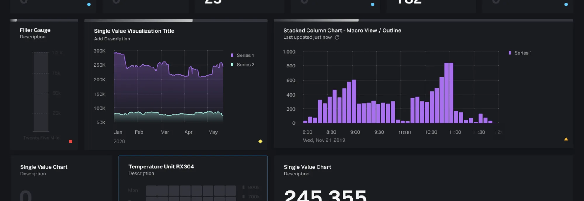
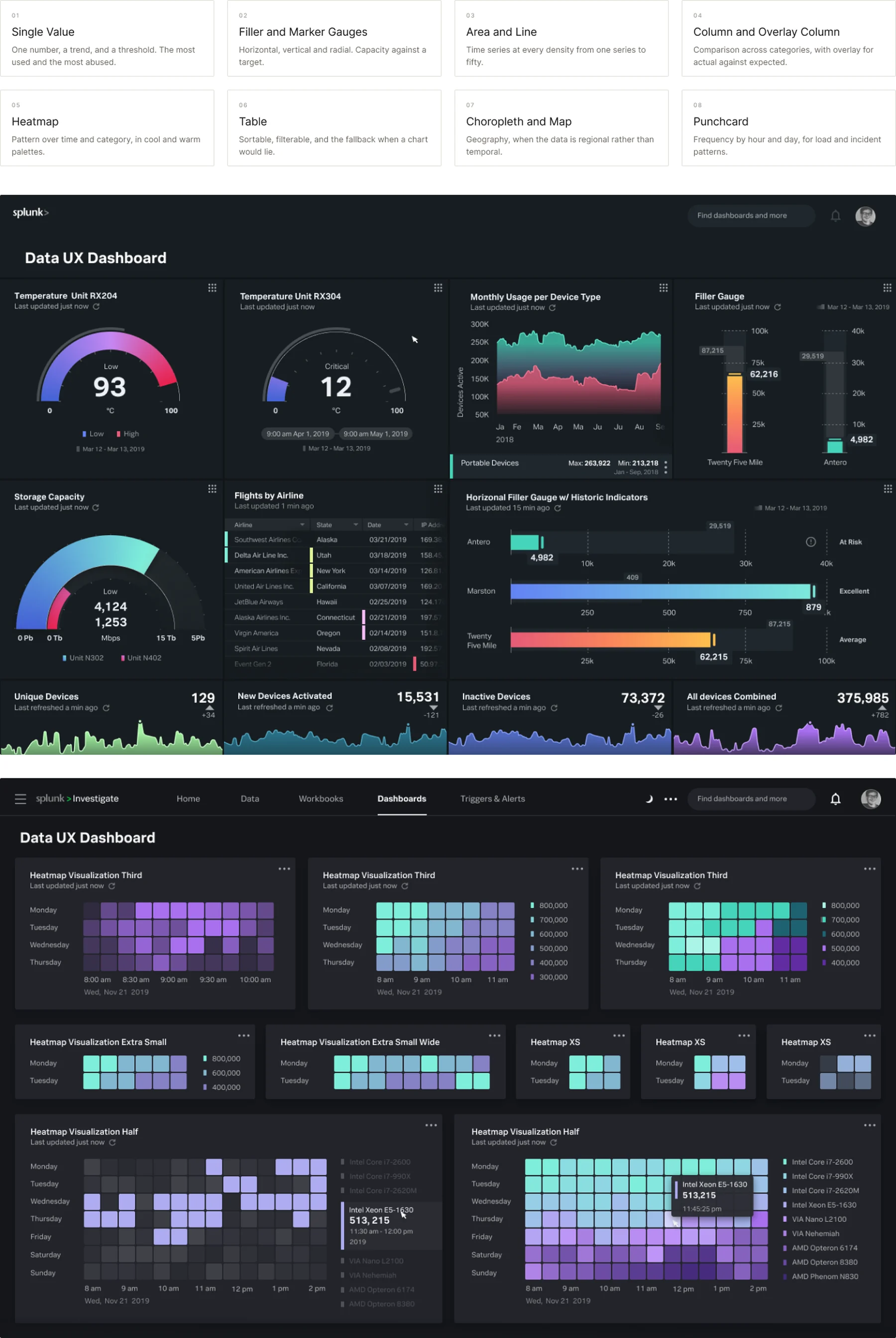
Data visualization is the centre of what Splunk does, and the platform was rendering it with an off-the-shelf charting library. Datadog was shipping dashboards that were more interactive and better resolved. A bespoke system stopped being a preference and became a competitive requirement.
The work started with an audit of every visualization the platform could already produce, and with research into how Splunk users actually read data under pressure. Not how charts are supposed to work. How an engineer scans a wall of gauges at three in the morning and decides which one matters.
From there the interactive layer was defined with engineering rather than handed to it: drill-down, filtering, adjustable views, and the sizing behaviour that lets the same chart stay legible in a quarter-width panel and a full-screen wallboard.
Section 07
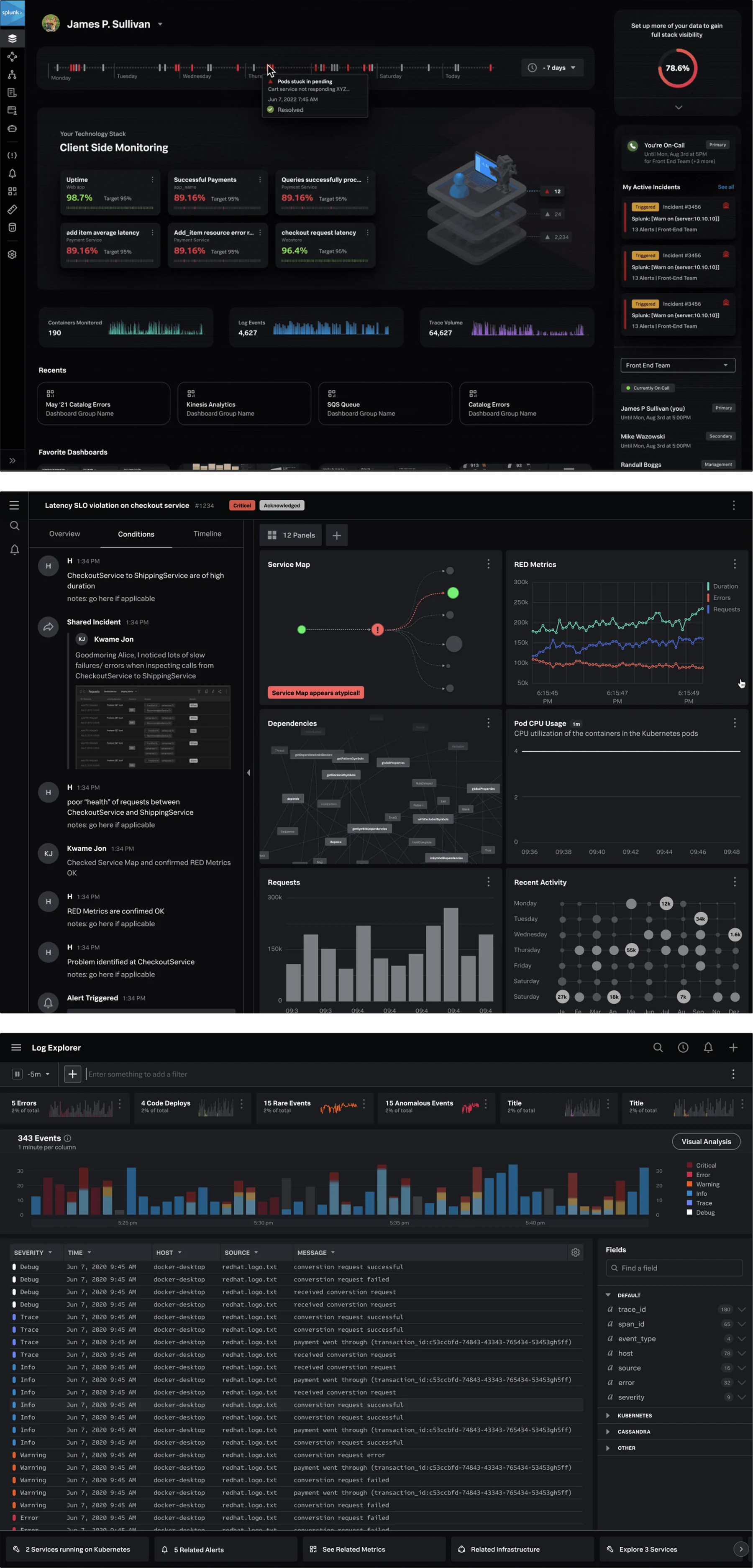
The Surfaces the System Had to Serve
A visualization system is only as good as the screens it has to survive. These are the three places Splunk users actually spend their day, and each one puts a different kind of pressure on the same components.
Section 08
A Typeface Commissioned for Numbers
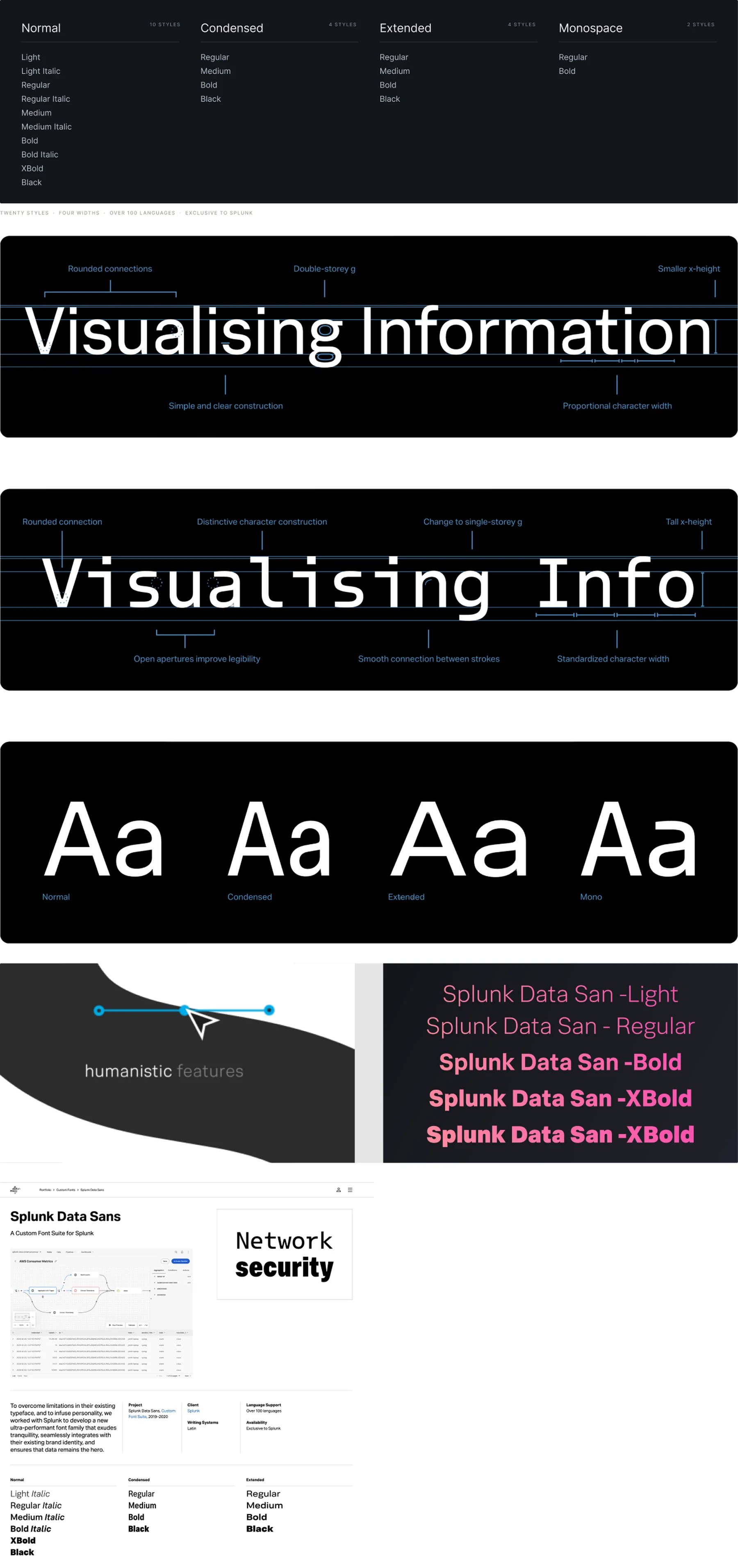
Most typefaces are drawn for reading sentences. Splunk’s interface is mostly figures, axis labels, units and identifiers rendered small, at low contrast, on dark backgrounds, next to each other. Splunk Data Sans was commissioned as a custom suite for that job, drawn between 2019 and 2020 and licensed exclusively to Splunk.
The brief was humanistic rather than geometric. Geometric faces look clean in a logo and fall apart in a table, where a one, a lowercase L and a capital I have to be told apart at eleven pixels while someone is deciding whether to page a colleague. Open apertures, distinguishable figures, and enough room in the counters that the glyph survives being small and dim.
Section 09
Dark by Default, Dense by Necessity
The Data UX team’s own brief named four constraints, and every component in the system had to answer all four. They are not the constraints of a marketing site, which is why borrowed patterns kept failing.

Section 10
Motion Carries the State
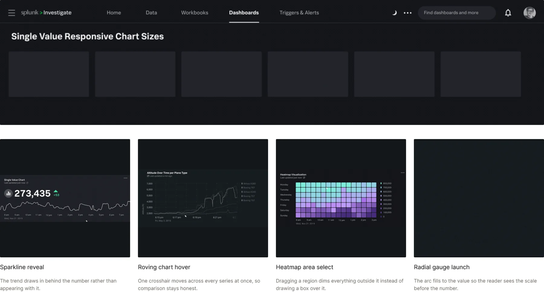
In a dashboard, motion is not decoration. It is how the interface says data is arriving, this value just changed, you are pointing at this series, or this selection is active. These were built as behaviours in the system rather than as one-off transitions.
Section 11
Democratic, Which Is Not the Same as Consensus
Retention was high, and the decision process is the likeliest reason. Every designer’s view carried weight, but the team was not run by vote. Direction was set, and then the reasoning behind it was shown rather than the conclusion announced.
A proposed solution, the rationale for it, and an open invitation to argue with both. That produces commitment instead of compliance, and it surfaces the objection early, while it is still cheap to act on.
In the situations that mattered most, the role was facilitator rather than decider: guide the team through the process, make sure every voice is actually heard, and let the work come out of deliberation. The alternative is a team that follows whoever spoke loudest, and that team does not stay.
Section 12
Getting Design a Seat at the Table
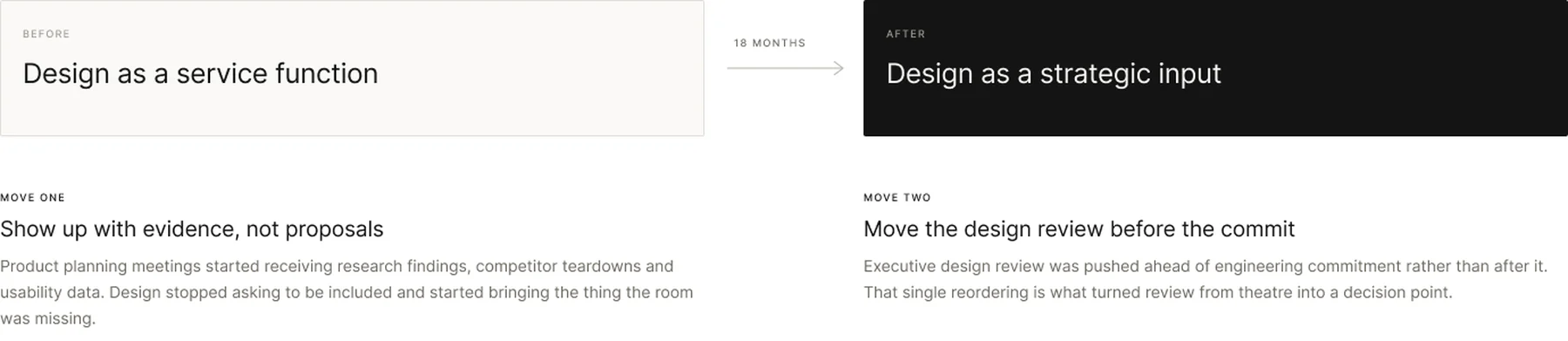
Design arrived as a service function. Requests in, deliverables out, no involvement upstream, no role in product strategy, no presence in executive review. Changing that was not a matter of asserting authority. It was a matter of becoming impossible to plan without.
Section 13
Outcome
Three years from a design organisation that did not exist to one with seventy-two people, a proprietary visualization system, a commissioned typeface, an embedded research function and a program management practice. UX maturity moved from early awareness to integrated.
The products got measurably easier to use, customer feedback improved, and the sales engineering workflows where the users actually lived got faster. The visualization gap with Datadog closed. In 2023 Cisco acquired Splunk for twenty-eight billion dollars.
That number belongs to a lot of people and a lot of causes. Design was part of the story rather than a footnote, which is a more useful claim than pretending it was the cause.
